The Crystal Creek Project: Fresh Traditional Style In East Greenwich
Not every home requires a heavy renovation to look and feel completely transformed. Sometimes, all you need is a fresh, new color palette, beautifully cohesive furnishings, and show-stopping lighting. Case in point: the spaces I’m sharing with you today from the newly completed CRYSTAL CREEK PROJECT.
MEET THE FAMILY & THEIR HOME
Who is behind this home refresh? Our clients are an active family that had recently purchased a beautiful 5,800 square-foot home in East Greenwich, Rhode Island. Built in 2012, it was in great condition and full of traditional character and charm that they love.
Before: Dining Room in East Greenwich
Their home is full of classic details, like molding, wainscoting, and ceiling millwork. It also embraced color in a few places (though not quite the right hues) and boasts ample windows for natural light. The family knew some simple updates and new furnishings would be enough to create modern-day comfort and freshness.
PROJECT SCOPE
Although a few cosmetic updates lay in store, it was mainly a furnishing project for the home’s first level, which included designing the entryway, living room, dining room, and powder room.
ENTRY
Our clients’ home came with a stunning black and white checkered floor, which creates a dramatic statement from the first step. We created some variation of a blue-green color palette for each space in the home, and in the entryway, we decided to express color through simple accents to let the bold flooring shine — literally and figuratively.
LIVING ROOM
For the living room, the clients desired a more muted, serene take on the blue-green color palette, favoring neutrals, layered textiles, and touches of organic materials.
Finished, we now have loads of comfortable seating options, soft drapery, and well-placed greenery to help the eye notice the outdoors.
The result is a space that feels open, bright, and ready for the whole family to cozy up and spend time together — even their dogs, thanks to performance fabrics!
DINING ROOM
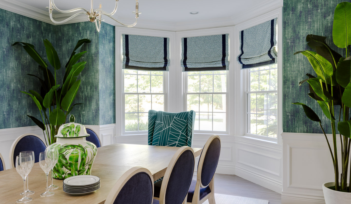
Our clients took a step out of their comfort zone for a bolder color palette in the dining room. With such a light and airy living room, we knew that richer colors would create a delightful alternative for vibrant family meals and conversation. Setting aside their initial reservations, our clients jumped on board with our vision and were thrilled with the result.
A textured wallpaper adds depth to the room while making it feel inviting and cozy. We also designed these custom Roman shades and layered in an area rug, dining table, custom upholstered chairs, accent host chairs, a transitional chandelier, and faux Banana Palms. Despite feeling upscale and elegant, there’s a wild streak in here, don’t you think?
In another space opposite the dining room, we have our clients’ home office and this view, where we used an equally intricate wallpaper, which works because the color palette and scale of each don’t compete.
THE CRYSTAL CREEK PROJECT: POWDER ROOM
The powder room’s sink, vanity, and hardware stayed the same and is a perfect illustration of how small changes can create big impact. We added a new light fixture, powder blue wallpaper with some movement, a fun mirror, and warmed it all up with a rug, art, and accessories. Just like new.


